🖨️ New to print design? Here's what every business owner needs to know before sending your files to the printer.
Whether you're ordering business cards, flyers, or a banner for your next pop-up, understanding a few essential print terms can save you time, money, and a lot of back-and-forth with your designer. Let’s demystify three of the most common (and misunderstood) terms in print design: fonts, bleeds, and CMYK.
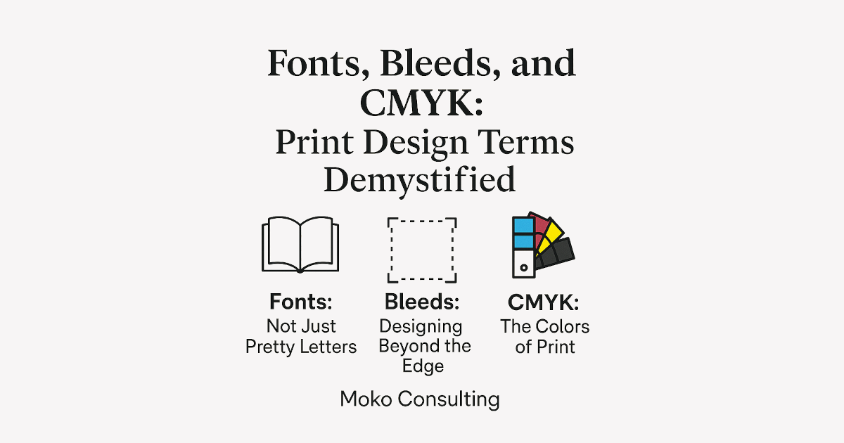
📚 Fonts: Not Just Pretty Letters
What it means: Fonts are the style of type used in your design—think Arial, Times New Roman, or that swirly script you love for invitations.
Why it matters: If your design uses a font that your printer doesn’t have, the text can appear jumbled or incorrect when they open the file. That’s why designers “outline” or “embed” fonts before sending to print.
✅ Tip: Always convert text to outlines or embed fonts in PDFs to ensure the printer sees what you see.
✂️ Bleeds: Designing Beyond the Edge
What it means: A “bleed” is extra image or color that extends past the edge of your final printed size. This gives printers a little wiggle room when trimming your piece to size.
Why it matters: Without a bleed, you risk having white edges on your final print—even if your design looks perfect on screen.
✅ Tip: Most printers recommend a 1/8" (0.125") bleed on all sides. That means your design should be slightly bigger than the finished product.
🎨 CMYK: The Colors of Print
What it means: CMYK stands for Cyan, Magenta, Yellow, and Black—the four ink colors used in standard printing.
Why it matters: Designs created in RGB (used for screens) may print with unexpected color shifts if not converted. Bright neons and glowing blues on screen don’t always look the same in print.
✅ Tip: Always convert your file to CMYK color mode before sending it to a commercial printer.
Bonus: Don’t Forget Resolution
300 DPI (dots per inch) is the gold standard for print. Anything lower can result in blurry or pixelated results.
Need Help? That’s What We’re Here For.
At Moko Consulting, we take the guesswork out of preparing your print materials. From font licensing to perfect bleeds and true-to-color output, our design team ensures your materials look sharp and professional—every single time.